Probability plots
Proabability plots are a general term for several different plotting techniques. One of these techniques is a graphical method for comparing two data sets and includes probability-probability (PP) plots and quantile-quantile (QQ) plots. The second plotting technique is used for assessing the goodness of fit of a distribution by plotting the empirical CDF of the failures against their failure time and scaling the axes in such as way that the distribution appears linear. This method allows the reliability analyst to fit the distribution parameters using a simple “least squares” fitting method for a straight line and was popular before computers were capable of calculating the MLE estimates of the parameters. While we do not typically favour the use of least squares as a fitting method, we can still use probability plots to assess the goodness of fit. The module reliability.Probability_plotting contains functions for each of the standard distributions supported in reliability. These functions are:
Weibull_probability_plot
Normal_probability_plot
Lognormal_probability_plot
Gamma_probability_plot
Beta_probability_plot
Exponential_probability_plot
Exponential_probability_plot_Weibull_Scale
Loglogistic_probability_plot
Gumbel_probability_plot
There is also a function to obtain the plotting positions called plotting_positions. This function is mainly used by other functions and is not discussed further here. For more detail, consult the help file of the function. To obtain a scatter plot of the plotting positions in the form of the PDF, CDF, SF, HF, or CHF, you can use the function plot_points. This is explained here.
Within each of the above probability plotting functions you may enter failure data as well as right censored data. For those distributions that have a function in reliability.Fitters for fitting location shifted distributions (Weibull_3P, Gamma_3P, Lognormal_3P, Exponential_2P, Loglogistic_3P), you can explicitly tell the probability plotting function to fit the gamma parameter using fit_gamma=True. By default the gamma parameter is not fitted. Fitting the gamma parameter will also change the x-axis to time-gamma such that everything will appear linear. An example of this is shown in the second example below.
Note
Beta and Gamma probability plots have their y-axes scaled based on the distribution’s parameters so you will find that when you overlay two Gamma or two Beta distributions on the same Gamma or Beta probability paper, one will be a curved line if they have different shape parameters. This is unavoidable due to the nature of Gamma and Beta probability paper and is the reason why you will never find a hardcopy of such paper and also the reason why these distributions are not used in ALT probability plotting.
API Reference
For inputs and outputs see the API reference.
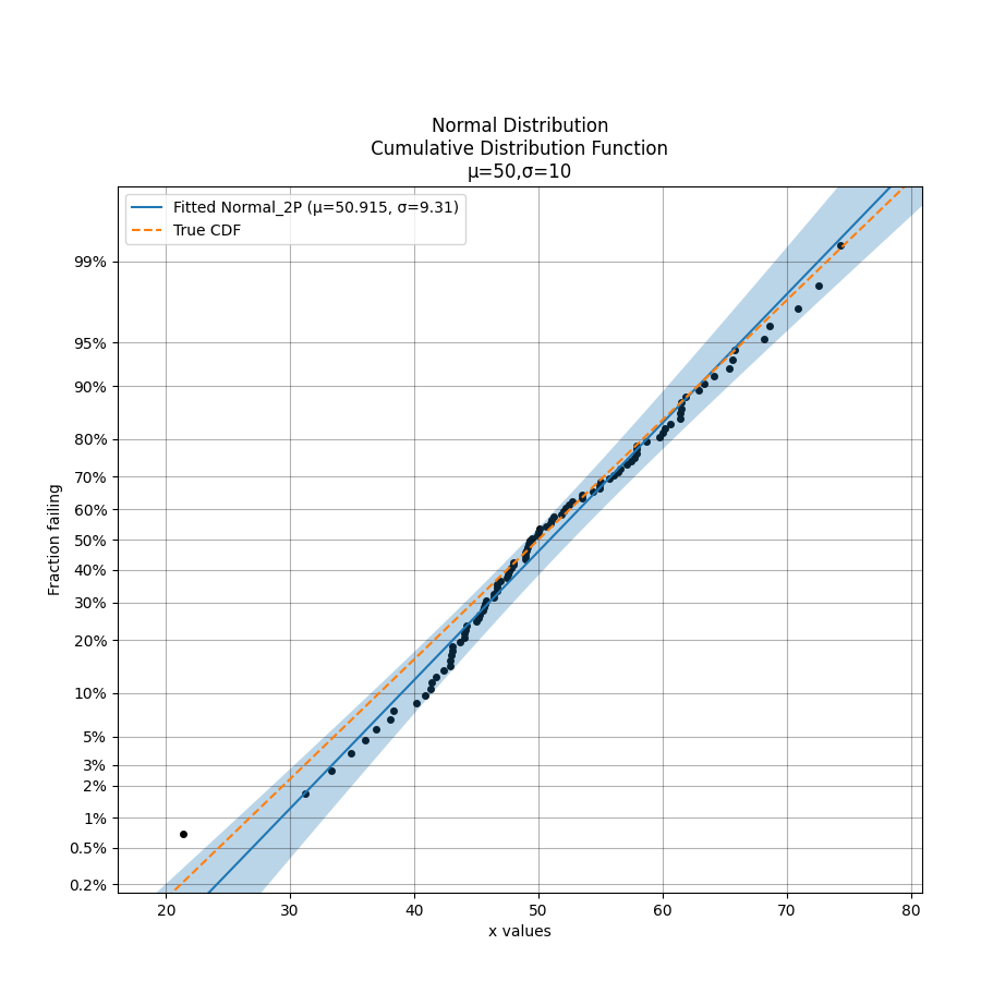
Example 1
In the example below we generate some samples from a Normal Distribution and provide these to the probability plotting function. It is also possible to overlay other plots of the CDF as is shown by the dashed line.
from reliability.Distributions import Normal_Distribution
from reliability.Probability_plotting import Normal_probability_plot
import matplotlib.pyplot as plt

dist = Normal_Distribution(mu=50,sigma=10)
failures = dist.random_samples(100, seed=5)
Normal_probability_plot(failures=failures) #generates the probability plot
dist.CDF(linestyle='--',label='True CDF') #this is the actual distribution provided for comparison
plt.legend()
plt.show()
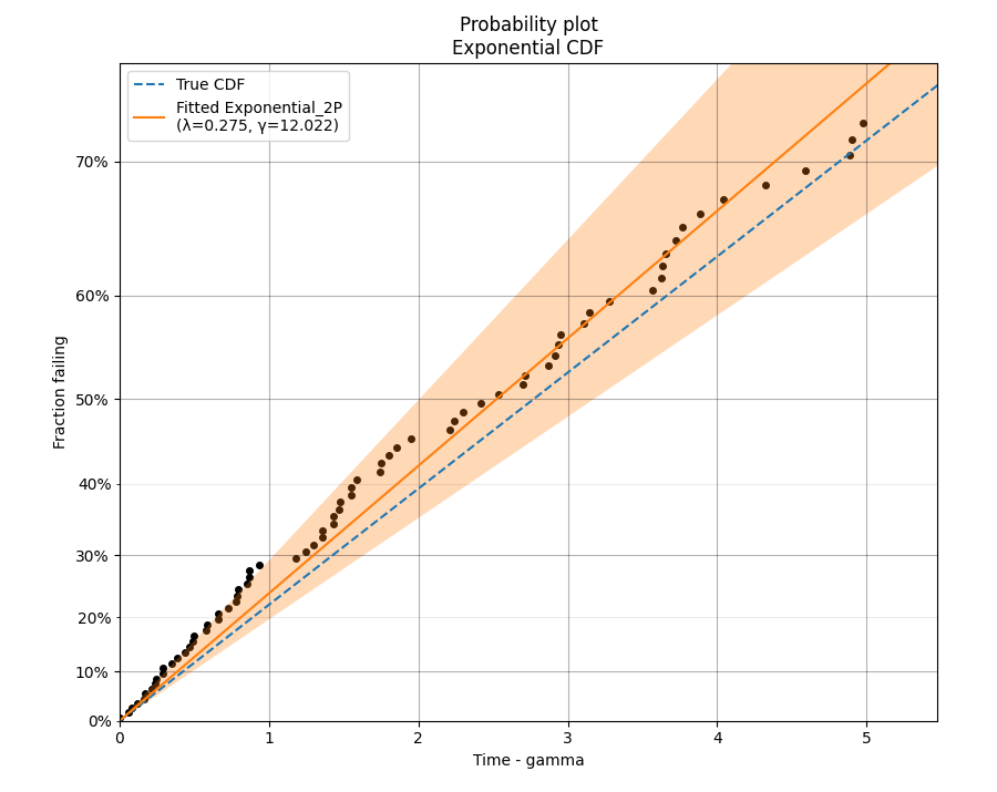
Example 2
In this second example, we will fit an Exponential distribution to some right censored data. To create this data, we will generate the random samples from an Exponential distribution that has a location shift of 12. Once again, the true CDF has also been plotted to provide the comparison. Note that the x-axis is time-gamma as it is necessary to subtract gamma from the x-plotting positions if we want the plot to appear linear.
from reliability.Distributions import Exponential_Distribution
from reliability.Probability_plotting import Exponential_probability_plot
import matplotlib.pyplot as plt
from reliability.Other_functions import make_right_censored_data

dist = Exponential_Distribution(Lambda=0.25, gamma=12)
raw_data = dist.random_samples(100, seed=42)  # draw some random data from an exponential distribution
data = make_right_censored_data(raw_data, threshold=17)  # right censor the data at 17
Exponential_Distribution(Lambda=0.25).CDF(linestyle='--', label='True CDF')  # we can't plot dist because it will be location shifted
Exponential_probability_plot(failures=data.failures, right_censored=data.right_censored, fit_gamma=True)  # do the probability plot. Note that we have specified to fit gamma
plt.legend()
plt.show()
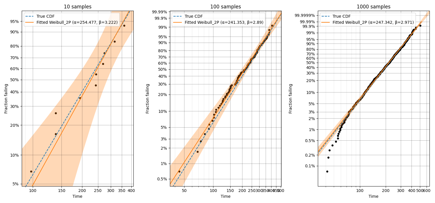
Example 3
In this third example, we will see how probability plotting can be used to highlight the importance of getting as much data as possible. This code performs a loop in which increasing numbers of samples are used for fitting a Weibull distribution and the accuracy of the results (shown both in the legend and by comparison with the True CDF) increases with the number of samples. We can also see the width of the confidence intervals decreasing as the number of samples increases.
from reliability.Distributions import Weibull_Distribution
from reliability.Probability_plotting import Weibull_probability_plot
import matplotlib.pyplot as plt

dist = Weibull_Distribution(alpha=250, beta=3)
for i, x in enumerate([10,100,1000]):
    plt.subplot(131 + i)
    dist.CDF(linestyle='--', label='True CDF')
    failures = dist.random_samples(x, seed=42)  # take 10, 100, 1000 samples
    Weibull_probability_plot(failures=failures)  # this is the probability plot
    plt.title(str(str(x) + ' samples'))
plt.gcf().set_size_inches(15, 7)  # adjust the figure size after creation. Necessary to do it after as it it automatically adjusted within probability_plot
plt.tight_layout()
plt.show()
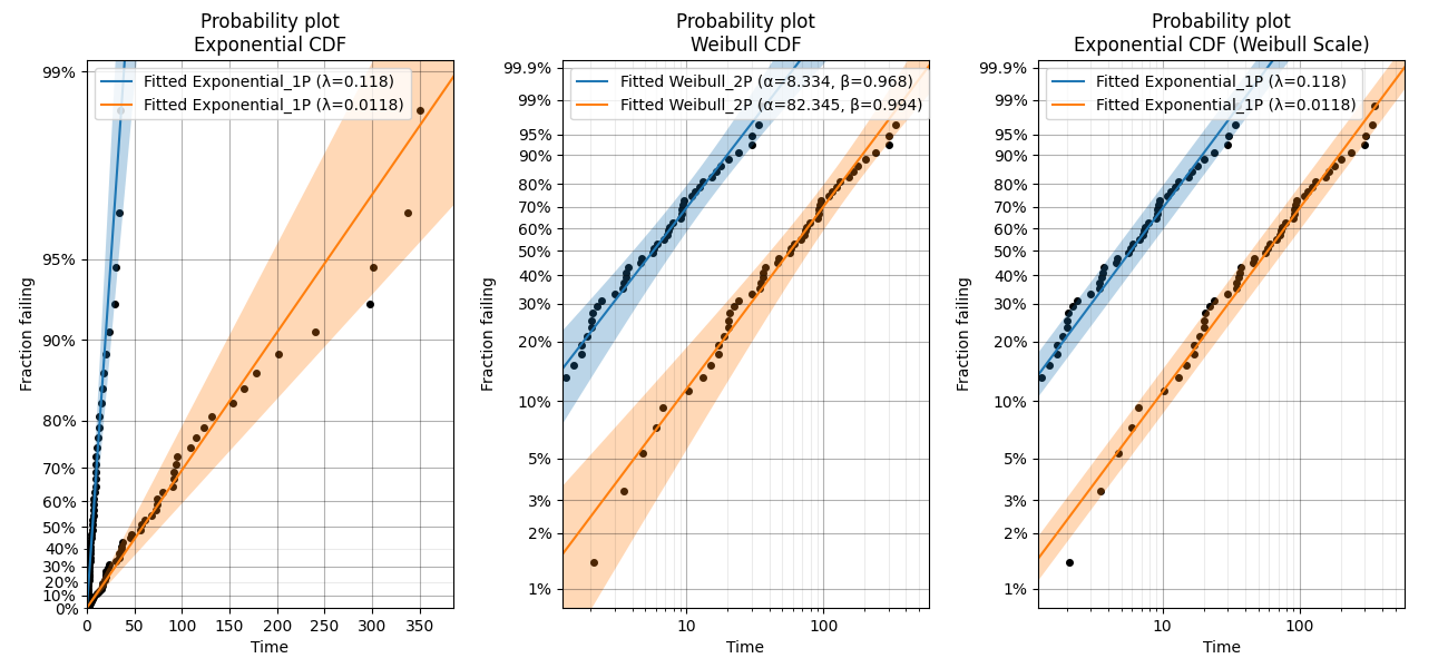
Example 4
In this fourth example, we will take a look at the special case of the Exponential probability plot using the Weibull Scale. This plot is essentially a Weibull probability plot, but the fitting and plotting functions are Exponential. The reason for plotting an Exponential distribution on Weibull probability paper is to achieve parallel lines for different Lambda parameters rather than having the lines radiating from the origin as we see in the Exponential probability plot on Exponential probability paper. This has applications in ALT probability plotting and is the default plot provided from Fit_Exponential_1P and Fit_Exponential_2P. An example of the differences between the plots are shown below. Remember that the Alpha parameter from the Weibull distribution is equivalent to 1/Lambda from the Exponential distribution and a Weibull distribution with Beta = 1 is the same as an Exponential distribution.
from reliability.Distributions import Exponential_Distribution
from reliability.Probability_plotting import Exponential_probability_plot, Weibull_probability_plot, Exponential_probability_plot_Weibull_Scale
import matplotlib.pyplot as plt

data1 = Exponential_Distribution(Lambda=1 / 10).random_samples(50, seed=42)  # should give Exponential Lambda = 0.01 OR Weibull alpha = 10
data2 = Exponential_Distribution(Lambda=1 / 100).random_samples(50, seed=42)  # should give Exponential Lambda = 0.001 OR Weibull alpha = 100
plt.subplot(131)
Exponential_probability_plot(failures=data1)
Exponential_probability_plot(failures=data2)
plt.subplot(132)
Weibull_probability_plot(failures=data1)
Weibull_probability_plot(failures=data2)
plt.subplot(133)
Exponential_probability_plot_Weibull_Scale(failures=data1)
Exponential_probability_plot_Weibull_Scale(failures=data2)
plt.gcf().set_size_inches(13, 6)
plt.subplots_adjust(left=0.06, right=0.97, top=0.91, wspace=0.30)  # format the plot
plt.show()
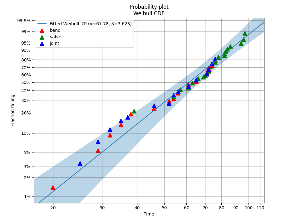
Example 5
In this example we will look at how to create a probability plot that has different colors representing different groups which are being analysed together. Consider corrosion failure data from an oil pipeline where we know the location of the corrosion (either the Bend, Valve, or Joint of the pipe). To show the location of the corrosion in different colors we need to hide the default scatter plot from the probability plot and then replot the scatter plot using the function plot_points. The function plot_points passes keyword arguments (like color) directly to matplotlib’s plt.scatter() whereas the probability_plot does some preprocessing of keyword arguments before passing them on. This means that it is only possible to provide a list of colors for the scatter plot to plot_points.
from reliability.Probability_plotting import Weibull_probability_plot, plot_points, plotting_positions
import matplotlib.pyplot as plt
import numpy as np

# failure data from oil pipe corrosion
bend = [74, 52, 32, 76, 46, 35, 65, 54, 56, 20, 71, 72, 38, 61, 29]
valve = [78, 83, 94, 76, 86, 39, 54, 82, 96, 66, 63, 57, 82, 70, 72, 61, 84, 73, 69, 97]
joint = [74, 52, 32, 76, 46, 35, 65, 54, 56, 25, 71, 72, 37, 61, 29]

# combine the data into a single array
data = np.hstack([bend, valve, joint])
color = np.hstack([['red'] * len(bend), ['green'] * len(valve), ['blue'] * len(joint)])

# create the probability plot and hide the scatter points
Weibull_probability_plot(failures=data, show_scatter_points=False)

# redraw the scatter points. kwargs are passed to plt.scatter so a list of color is accepted
plot_points(failures=data, color=color, marker='^', s=100)

# To show the legend correctly, we need to replot some points in separate scatter plots to create different legend entries
x, y = plotting_positions(failures=data)
plt.scatter(x[0], y[0], color=color[0], marker='^', s=100, label='bend')
plt.scatter(x[len(bend)], y[len(bend)], color=color[len(bend)], marker='^', s=100, label='valve')
plt.scatter(x[len(bend) + len(valve)], y[len(bend) + len(valve)], color=color[len(bend) + len(valve)], marker='^', s=100, label='joint')
plt.legend()

plt.show()
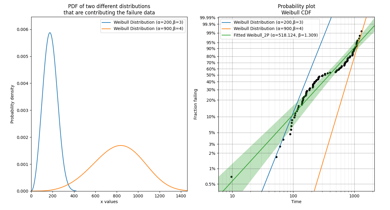
Example 6
In this final example, we take a look at how a probability plot can show us that there’s something wrong with our assumption of a single distribution. To generate the data, the random samples are drawn from two different distributions which are shown in the left image. In the right image, the scatterplot of failure times is clearly non-linear. The green line is the attempt to fit a single Weibull_2P distribution and this will do a poor job of modelling the data. Also note that the points of the scatterplot do not fall on the True CDF of each distribution. This is because the median rank method of obtaining the plotting positions does not work well if the failure times come from more than one distribution. If you see a pattern like this, try a mixture model or a competing risks model. Always remember that cusps, corners, and doglegs indicate a mixture of failure modes.
from reliability.Probability_plotting import Weibull_probability_plot
from reliability.Distributions import Weibull_Distribution
import matplotlib.pyplot as plt
import numpy as np

dist_1 = Weibull_Distribution(alpha=200, beta=3)
dist_2 = Weibull_Distribution(alpha=900, beta=4)
plt.subplot(121)  # this is for the PDFs of the 2 individual distributions
dist_1.PDF(label=dist_1.param_title_long)
dist_2.PDF(label=dist_2.param_title_long)
plt.legend()
plt.title('PDF of two different distributions\nthat are contributing the failure data')
plt.subplot(122)  # this will be the probability plot
dist_1_data = dist_1.random_samples(50, seed=1)
dist_2_data = dist_2.random_samples(50, seed=1)
all_data = np.hstack([dist_1_data, dist_2_data])  # combine the failure data into one array
dist_1.CDF(label=dist_1.param_title_long)  # plot each individual distribution for comparison
dist_2.CDF(label=dist_2.param_title_long)
Weibull_probability_plot(failures=all_data)  # do the probability plot
plt.gcf().set_size_inches(13, 7)  # adjust the figure size after creation. Necessary to do it after as it it automatically ajdusted within probability_plot
plt.subplots_adjust(left=0.08, right=0.96)  # formatting the layout
plt.legend()
plt.show()
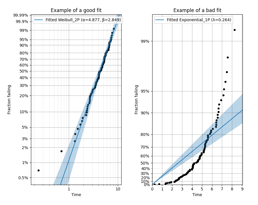
What does a probability plot show me?
A probability plot shows how well your data is modelled by a particular distribution. By scaling the axes in such a way that the fitted distribution’s CDF appears to be a straight line, we can judge whether the empirical CDF of the failure data (the black dots) are in agreement with the CDF of the fitted distribution. Ideally we would see that all of the black dots would lie on the straight line but most of the time this is not the case. A bad fit is evident when the line or curve formed by the black dots is deviating significantly from the straight line. We can usually tolerate a little bit of deviation at the tails of the distribution but the majority of the black dots should follow the line. A historically popular test was the ‘fat pencil test’ which suggested that if a fat pencil could cover the majority of the data points then the fit was probably suitable. Such a method makes no mention of the size of the plot window which could easily affect the result so it is best to use your own judgement and experience. This approach is not a substitute for statistical inference so it is often preferred to use quantitative measures for goodness of fit such as AICc and BIC. Despite being an imprecise measure, probability plots remain popular among reliability engineers and in reliability engineering software as they can reveal many features that are not accurately captured in a single goodness of fit statistic.
Example 7
from reliability.Probability_plotting import Weibull_probability_plot, Exponential_probability_plot
from reliability.Distributions import Weibull_Distribution
import matplotlib.pyplot as plt

data = Weibull_Distribution(alpha=5,beta=3).random_samples(100,seed=1)
plt.subplot(121)
Weibull_probability_plot(failures=data)
plt.title('Example of a good fit')
plt.subplot(122)
Exponential_probability_plot(failures=data)
plt.title('Example of a bad fit')
plt.subplots_adjust(bottom=0.1, right=0.94, top=0.93, wspace=0.34)  # adjust the formatting
plt.show()
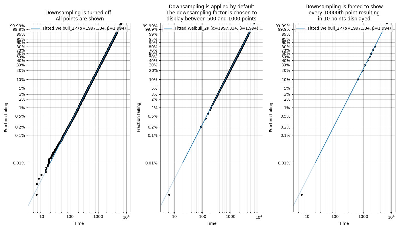
Downsampling the scatterplot
When matplotlib is asked to plot large datasets (thousands of items), it can become very slow to generate the plot. To show probability plots when fitting distributions to large datasets, reliability allows for the scatterplot to be downsampled.
Downsampling only affects the scatterplot, not the calculations. It is applied automatically for all probability plots (including when these plots are generated as an output from the Fitters), but can be controlled using the “downsample_scatterplot” keyword.
If “downsample_scatterplot” is True or None, and there are over 1000 points, then the scatterplot will be downsampled by a factor. The default downsample factor will seek to produce between 500 and 1000 points. If a number is specified, it will be used as the downsample factor. For example, if 2 is specified then every 2nd point will be displayed, whereas if 3 is specified then every 3rd point will be displayed.
The min and max points will always be displayed in the downsampled scatterplot which preserves the plotting range.
See the API documentation for more detail on the default in each function.
Example 8
In this example, we will see how downsampling affects the probability plot for a dataset with 100000 datapoints.
from reliability.Fitters import Fit_Weibull_2P
from reliability.Distributions import Weibull_Distribution
import matplotlib.pyplot as plt

data = Weibull_Distribution(alpha=2000,beta=2).random_samples(100000,seed=1)

plt.subplot(131)
Fit_Weibull_2P(failures=data,print_results=False,downsample_scatterplot=False)
plt.title('Downsampling is turned off \n All points are shown')

plt.subplot(132)
Fit_Weibull_2P(failures=data,print_results=False)
plt.title('Downsampling is applied by default\nThe downsampling factor is chosen to\ndisplay between 500 and 1000 points')

plt.subplot(133)
Fit_Weibull_2P(failures=data,print_results=False,downsample_scatterplot=10000)
plt.title('Downsampling is forced to show\nevery 10000th point resulting\nin 10 points displayed')

plt.gcf().set_size_inches(14,8)
plt.tight_layout()
plt.show()